 I recently had the privilege of being one of three judges in the 2020 Nelson National Triptych Salon, hosted by the Nelson Camera Club of New Zealand. I thoroughly enjoyed looking at the 466 entries and am heartened that the art of creating a triptych is alive and well in this country.
It’s often the nature of a big, national competition like this, that feedback to individual photographers can be limited to an ‘Accepted’ or ‘Not Accepted’ result. So, in an effort to provide some general feedback to participants and prospective entrants in the future, I thought I’d offer some observations and tips to help improve your triptych making.
At the end of this blog post, I’ll also be showing you the top four triptychs in the Salon with accompanying commentary on the winning images. The authors of these images have very kindly allowed me to share their wonderful creations with you in this article.
What do you want to say and how are you going to say it?
As with any single photograph, a triptych must communicate something to the viewer, and the way in which the three panels combine to achieve this is the key.
Is an emotion, message, theme or story enhanced or developed by conveying it within three different panels?
How successfully can the triptych be understood and processed as a cohesive and unified visual experience?
Do the three panels have more meaning and context when viewed together rather than apart?
Are the three panels balanced in terms of subject matter and visual continuity?
Are shapes and patterns expanded upon across the three panels?
With a bit of luck, these fundamental questions will encourage you to think about your choice of subject and how you can approach, present and craft your material (whatever it may be) into a compelling and creative triptych.
In the Mind of a Triptych Judge
Alright, time for some observations and ‘dos and don’ts’ from the Salon. I want to stress these are just my own personal perspectives, ideas and criteria, but I hope they’re helpful and will give you an insight into my judging process!
Read and Follow the Rules
Please, please, please, make sure you read the competition guidelines and follow the instructions! This may seem pretty basic advice, but there were triptychs which I really enjoyed and would have accepted were it not for the fact that they didn’t comply with the rules. The two biggest offending areas:
- having the background act as a 4th image
- having the panels touch or overlap – you must have some separation between your panels
Choice of Background Colour
Be very careful with your choice of background colour – something neutral is best for most triptychs and even black can be very effective. Unfortunately, some backgrounds were too intrusive. Essentially, you don’t want the background colour to draw attention away from the panels, or clash with the colour palette of the triptych. Keep it simple.
A Single Image Divided into Three
There were many beautiful images which worked extremely well as a single image, but which didn’t work as successfully in the triptych format – the splitting into panels did nothing to ‘add value’ or enhance the original image. In some instances, the cuts were distracting.
If you’re not totally convinced that by cutting your image into three parts, you can convey your story better, or communicate your vision with greater clarity, don’t do it.
1 + 1 + 1 = 3 – It’s a Triptych – Right?
Well, yes – mathematically, but it doesn’t always work for a triptych. What do I mean? You may have taken three shots in a particular location or area, so thematically or geographically, all three images have a connection in that regard.
However, I don’t believe you can put three images together of a location and call it a triptych without there being some additional compositional or structural connection between the panels. The images still need to ‘flow’ and have something to visually link them together for the viewer to comprehend and process what they see as an actual ‘triptych’. On several occasions, it felt like three separate and distinct images were being placed next to each other and unfortunately, these didn’t function well as a whole.
All Creatures Great and Small
The Salon included many triptychs of various birds, animals and portraits of people. With this type of subject matter, to really make your triptych stand out:
- try to tell a compelling story
- show a sequence of events which are unusual or unexpected
- photograph your subject from a different and creative angle of view
For me, three very similar ‘portraits’ of the same subject which don’t have these extra ‘creative’ factors aren’t enough, neither is the subject doing essentially the same thing in each image with minimal variation going to be strong enough to gain an ‘Acceptance’.
An extra word of caution – try not to have the background in each image too busy and/or different; it will distract from the subject.
Flower Power
While depicting a flower (or even insect) in its growth cycle lends itself well to the triptych format – it has been done a lot! My feeling is that in a competition setting, it will need to be exceptionally well done, both technically and creatively, to achieve success. Something with a slight twist on this theme, and a different viewpoint added into the mix will help to elevate the triptych and set it apart from the other entries.
Photo Journalism Style Triptychs
If you are creating a triptych of a sporting or civic event, the usual rules apply. Try to avoid just putting three images of the same event next to each other which have no linear or sequential connecting factor. Aim to show a developing story with your panels where all three of the images are required to explain or depict the whole proceeding. While each image of the triptych, in isolation, may convey the ‘flavour’ of the event, the three images, in combination, ideally should provide greater overall context, clarity and understanding of what has taken place.
Technical Competency
Technical competency is not the highest priority for me; I rate creative vision and communication far higher. However, the images do need to be of a high standard. Any glaring deficiencies will lesson your chance of making a good first impression and hinder your chances of success.
Different Triptych Layouts
I was really pleased to see some experimentation and a wide variety of different triptych layouts used by the Salon entrants. There was a good mix of vertical, horizontal and T-junction placements as well as some images being cut on a diagonal. Some triptychs contained panels of different sizes and some panels were also placed in a staggered, step-like design. There were even circular and oval panels.
When I assess a triptych’s composition, I look for how the panels are used to enhance the subject matter or story, and how successfully their arrangement provides a unified and coherent visual experience:
- how easily can my eyes move from image to image in a storytelling narrative?
- does the presentation draw my attention to a particular area of interest?
- do I get ‘stuck’ anywhere in the triptych which prevents me from enjoying the whole experience?
- are the panels balanced and weighted evenly?
- how are patterns, shapes and colours echoed across the panels?
Good for a Laugh!
Humour goes a long way. I’m certainly not averse to authors injecting a bit of humour and light relief into their triptychs. Several of the entries in the Salon put a big smile on my face, either with their ingenious interpretation of a subject, depiction of an entertaining and amusing story, or presentation of a person or animal in a rare and comical situation.
A creative or playful title can also be a big plus.
The Winning Triptychs
Let’s now take a look at the winning triptychs from the Salon. Once again, I’d like to thank the authors for their willingness to make these images available for this blog post.
These four triptychs really hit the mark and embody the elements which myself and the other judges were looking for:
- creativity
- succinct and clear communication
- clarity of vision
- engagement and interest
- a high degree of technical competence
My accompanying commentary for each triptych will hopefully shed a little more insight into why we selected these images for the top awards.

‘Lake Ruataniwha Abstract’ is an excellent example of ‘less is more’, with the author skilfully relying on alignment, balance and correct proportion to bring the whole triptych together. There are several corners to be navigated as the viewer moves from panel to panel, the buoys receding and advancing in an easy regularity. With its minimalist, graphic qualities, clever pattern development and ‘out of the box’ thinking, ‘Lake Ruataniwha Abstract’ is a testament to the author’s creative vision.

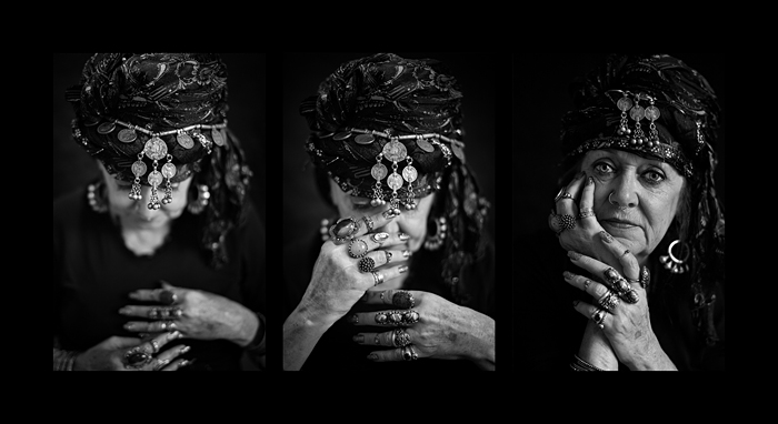
The three images in ‘Fortune Teller’ are not only excellent black and white portraits; more importantly, they present a developing and engaging storyline. With an inspired and ingenious use of depth of field, the author takes the viewer on a mysterious journey. Present, but not in focus, the fortune teller looks inwards, finding her inspiration. Gaining greater clarity in her future insights, her expressive hands come more to the fore, until finally, in the third image, she is crystal clear, eyeballing the camera, ready to deliver her prognostications.

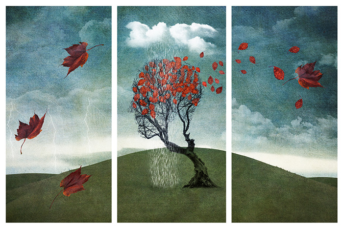
‘A Brain Storm’ is a wonderfully creative and very clever interpretation of the ‘Weather’ category. There’s a bit of everything; pouring rain, brooding thunder clouds and crackling lightening. All are judiciously presented and carefully balanced within the three panels, especially the swirling leaves. With a deft touch of storytelling thrown into the mix, maybe there’s a glimmer of hope as the ‘brain storm’ rages and then passes, with clearer skies hinted at on the distant horizon.

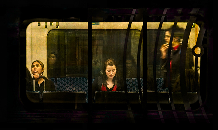
A beautiful, complex, compelling and engaging triptych, ‘Midnight Train to Georgia’ poses many questions for the viewer and makes us wonder. Each of the women inhabit their own panel and project their own story and emotions. One clasps a suitcase with a querying, anxious look, another’s eyes are averted in quiet contemplation, while the third hurries into the carriage, pensively stroking her chin. The three panels serve to highlight our protagonists’ isolation and inner worlds, even though they are only a few feet apart. In a haunting twist, the almost ghostly reflections in the glass add yet another dimension – spectral observers also separated from their worldly counterparts.
Final Thoughts
There were many great entries in the Salon and it was fantastic to see so many authors putting forward their work.
I hope the Nelson National Triptych Salon continues to be well supported in the future, and becomes a permanent fixture in the New Zealand photography scene for many years to come! Kudos to the organisers for running such a well-oiled and professional Salon.
